How to Pick a Nursery Theme: A 5-Question Framework
A first-time nursery search usually starts on Pinterest. Two weeks later there are 200 pins saved, half of them nearly identical, and the decision feels further away than it did at the start. The problem is not a shortage of pretty rooms. The problem is that lists hand parents more options when what they actually need is a way to decide.
This post is the other thing. Five questions that turn the choice into a sequence, with a recommended approach at the end of each one. By the time the last question is answered, the design brief is mostly written. The framework below is how Whimsy Tots founder Lois Winstead, a former interior designer and mom of two, walks her own customers through the choice.
Before the five questions
The questions are in order on purpose. Q1 sets the time horizon, which changes the answer to everything else. Q2 settles whose taste leads. Q3 decides how much wall is involved. Q4 picks between the three visual approaches the wallpaper can take. Q5 handles the boy-girl-neutral question that most posts skirt.
None of the questions has a right answer. They all have an honest answer, which is different. The recommended approach at the end of each question is the design move that follows from being honest about that answer. If any answer feels uncertain at first, the slower read of that section will usually surface the real one.
Question 1: How old is the child today, and how long will this room last?

The question is two-part on purpose. The child's age today rarely matters as much as the time horizon. A newborn nursery that the parents already plan to redo at age four is a two-to-three-year design window. A toddler room in a house the family expects to stay in for ten years is a much longer commitment.
The short way to think about it: peel and stick wallpaper is removable, so the cost of choosing wrong is lower than for traditional wallpaper. But removable still takes effort, and most parents do not want to redecorate a kid's room more than once or twice in childhood.
Three rough time horizons:
- Short (one to three years). Lean into something specifically baby or toddler. Soft pastels, woodland animals, little vehicles. The child will outgrow it, but that is the point. The cost of replacement is low because peel and stick comes off cleanly.
- Medium (three to seven years). Neutral palette with motifs that age up. A forest scene reads as nursery for a newborn and as outdoor play for a six-year-old. Same wall, different stories at different ages.
- Long (seven or more years). Abstract pattern or nature scene with no obvious baby cues. Soft greens and creams, geometric shapes, gentle landscapes. The kind of wall the parent could imagine in a guest room.
Recommended approach: design for the span, not the moment. Even if the toddler is obsessed with a specific theme today, that obsession will not last past the next year. For newborn nurseries, the material and ventilation choices matter as much as the visual ones, and the nursery wallpaper safety guide covers what safe actually means in practice. If timeframe alone is already settled, the quiz can pick up the rest from here.
Question 2: Whose taste leads, the child's or the parent's?

The honest answer for most baby and toddler rooms is the parent's. Babies do not have wallpaper opinions. Two-year-olds do, but they change weekly. Parents look at the wall in those rooms more than most parents expect: during 3am feeds, naptime rocking, bedtime stories. The wall is part of the parent's daily mental landscape for years.
For older children with real preferences (roughly age four and up), the answer shifts. Kids who can articulate "I want sharks" or "I want unicorns" should get a say. But getting a say is not the same as picking the design unsupervised from a catalog of 2,000 options. Parents curate the shortlist. Kids pick from the shortlist.
The most common mistake at this question is showing a three-year-old fifty designs and expecting a useful answer. The child will pick whatever is on screen at the moment of distraction. Parents end up with a wall that nobody actually loved.
Recommended approach: for babies and toddlers, parents decide. For older kids, parents curate, then loop the child in for the final two or three options. The parent enjoying the wall is the right metric because the parent is the one living with it during the hardest parts of the early years. A separate note worth saying out loud: this is also where pressure from outside (in-laws, decorators, social media) tends to push the answer away from what the parent actually wants. The honest answer for whose taste leads is rarely "my mother-in-law's."
Halfway through the framework?
The Whimsy Tots quiz asks these same questions and turns the answers into a curated short list. About a minute end to end.
Take the quizQuestion 3: One feature wall, or the whole room?

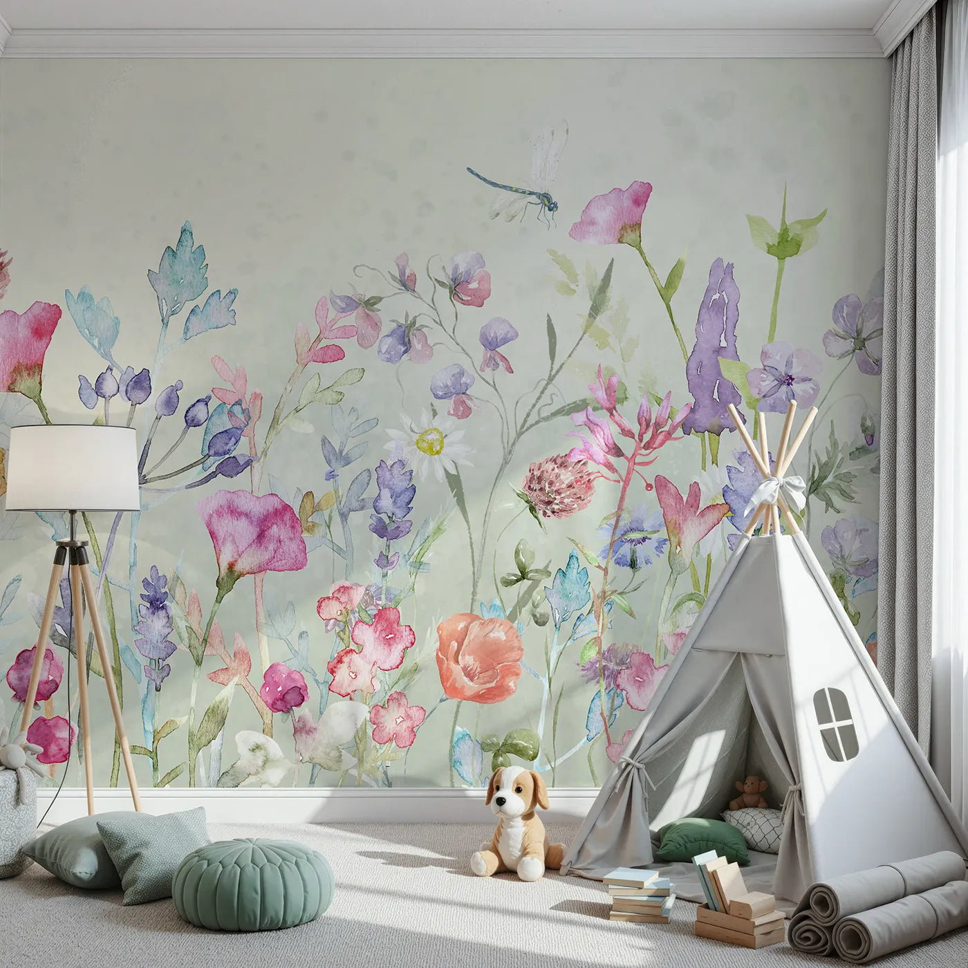
The question is about visual weight. A nursery with one papered feature wall and three calmly painted walls feels balanced. The wallpaper does the heavy lifting on one wall, and the eye rests on the other three. A room with wallpaper on all four walls is a different decision: it works, but it commits the whole room to one mood and one palette.
Three common scenarios:
- One feature wall. The most common nursery choice. Usually the wall behind the crib, sometimes the wall opposite the door. The other walls stay neutral with warm white, soft cream, or gentle pastel paint. Easiest to live with. Easiest to update later if the rest of the room changes.
- Whole room or three walls of four. Works best with quieter wallpaper that reads as background more than foreground. A whole room of busy storybook scenery exhausts the eye over months. A whole room of small repeating leaves does not.
- Lower or upper half of the wall only. A horizontal break around chair-rail height divides the wall into two zones. One zone is wallpaper, the other is paint. This is a softer commitment than full-wall and works especially well for shared rooms or rooms that need to age up gracefully.
Recommended approach: most first-time nursery rooms benefit from a single feature wall. It is the highest visual impact for the lowest commitment, and it leaves room for the rest of the design to evolve. Whole-room or split-wall makes sense once the parent has clear intent about the room's overall mood, not as a default choice.
Question 4: A continuous scene, a repeating pattern, or a transitional zone?

Once the wall area is settled, the next decision is what visual logic that area follows. Whimsy Tots makes three different products that handle this differently, and the choice between them is its own decision.
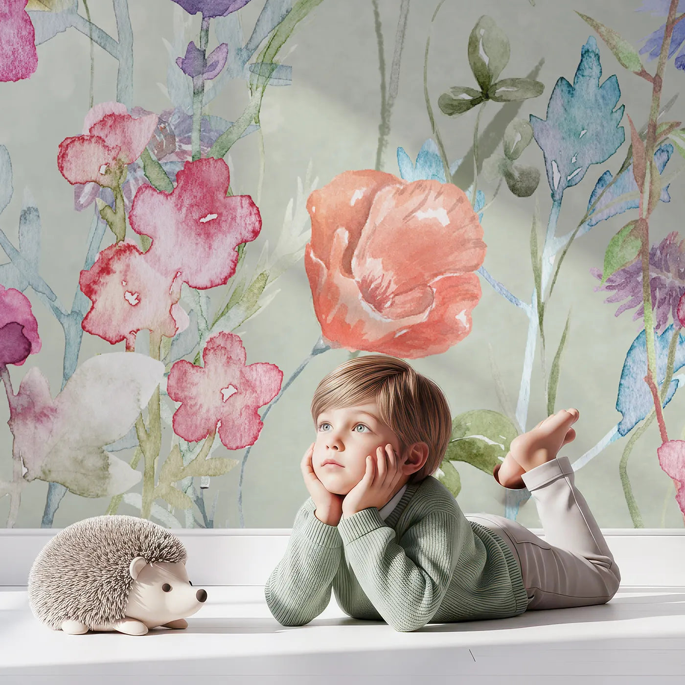
- A continuous scene is a Wall Mural. The wall tells one story across multiple panels: a forest, a meadow, a harbor scene. The composition is designed as a single image with focal points (a deer in the clearing, a moon over the waves). When the panels are installed in order, they form one continuous picture. Best when the wall is meant to be the room's emotional centerpiece.
- A repeating pattern is Pattern Wallpaper. The motif tiles seamlessly across the wall: small clouds, scattered stars, abstract leaves. There is no single focal point, and the wall reads as texture more than as a place. Best when the wall is a backdrop and other elements (the crib, an art print, the child) are the focus.
- A transitional zone is Wainscoting Wallpaper. The wallpaper covers the lower half of the wall, with paint or another finish above. The horizontal break creates a structural division that softens the visual weight of any pattern or scene. Best for shared rooms, rooms with low ceilings, or parents who want the wallpaper present without committing the whole wall to it.
Recommended approach: match the visual logic to the room's actual emotional center. If the wall is supposed to be the moment the visitor notices first, a Wall Mural earns that role. If the wall is a backdrop to the crib or the play space, Pattern Wallpaper does the quieter job better. If the room benefits from a structural break (chair-rail height, divided palette, shared with siblings), Wainscoting Wallpaper is the answer.
After this question is settled, the material decision becomes the next step. Whimsy Tots offers three materials (Signature Fabric, Performance Vinyl, Classic Paper), each suited to different use cases. The materials guide walks through which one fits a given room.
Question 5: Boy, girl, or neutral, and does that matter?

The question has gotten more politically loaded than it needs to be. The honest answer is that some parents want a wall that signals a girl's room or a boy's room, and some do not. Both are valid design positions.
The trap is the middle ground. Trying to make a "neutral" design that is actually still heavily gendered, or trying to make a "girl's" design generic enough to pass as neutral, produces walls that feel like nobody's room. The wall reads as compromise, and compromise rarely looks confident.
Three honest framings:
- Yes, signal a girl's room. Soft pinks, florals, fairy-tale motifs. A pink palette is fine. A princess motif is fine. The parent who wants this should not be made to feel they should want something else.
- Yes, signal a boy's room. Soft blues, adventure motifs, transportation themes. The same rule applies. A blue palette and a vehicle pattern is a valid choice.
- No, keep it open. This is the right call for shared rooms, for parents whose plans for second children are open, or for parents who simply prefer to design around the child rather than around gender. Sage greens, warm naturals, woodland animals, abstract scenes. The palette and motif should still feel specific because neutral does not mean bland.
Recommended approach: own the answer. The wall that confidently signals one direction will always look better than the wall that tries to hedge. There is no right answer to this question, only an honest one. The parent who picks pink and floral on purpose will be happier with the result than the parent who picks pink and floral while pretending it's "soft neutral." Same for the parent who picks sage and woodland because they genuinely want gender-open, versus the parent who picks it because they think they should.
If the five questions are answered
By this point the design brief is mostly written. The reader knows the time horizon, whose taste leads, how much wall to commit, which visual approach fits, and which palette direction to aim at.
Two paths forward from here. The first is to take the quiz, which asks these same questions in interactive form and surfaces the Whimsy Tots designs that match. The quiz is the fastest way to translate the framework into a shortlist.
The second is to browse directly. Parents who want to look through options before committing to a recommendation can start with the theme guide, which groups Whimsy Tots designs into four feel-led categories rather than a generic ideas list.
And once a design is picked, the install guide covers the three mistakes most first-time peel-and-stick installs run into. Worth reading before the mural arrives, not after.
A note on Whimsy Tots
Whimsy Tots was founded by Lois Winstead, a former interior designer and mom of two, after her own search for nursery wallpaper turned up the same problem this post addresses: hundreds of pretty options, no way to decide. The framework above is the version of that conversation she has with her own customers when they email asking for help.
The Whimsy Tots range includes Wall Murals (designed as continuous scenes across 4 to 8 panels), Pattern Wallpapers (designed to repeat across one or more walls), and Wainscoting Wallpapers (designed for lower-wall installation, around chair-rail height). Each is available in three materials: Signature Fabric, Performance Vinyl, and Classic Paper.
For parents who want to skip directly to a curated short list, the find-your-style quiz is the fastest path. For parents who prefer to think it through first, the framework above is the slower version of the same conversation.
Have a question about kids' wall decor? Email hello@whimsytots.com - Lois reads every one.

Lois Winstead is the founder of Whimsy Tots and a mom of two. A former interior designer, she started Whimsy Tots after struggling to find safe, beautifully designed wall decor for her own kids' rooms.
How to Install Peel and Stick Wallpaper: 3 Mistakes to Avoid
Are Peel and Stick Wallpapers Safe for Babies?
Related Posts

How to Install Peel and Stick Wallpaper: 3 Mistakes to Avoid

Fabric, Vinyl, or Paper: Best Peel and Stick Material Guide

Nursery Wallpaper Ideas: A Theme Guide for First-Time Moms